Leica M9 Digital Rangefinder Camera - Page 16 Index of Thorsten Overgaard's user review pages on Leica M9, Leica M9-P, Leica M-E, Leica M9 Monochrom, Leica M10, Leica M10-P, Leica M10-D, Leica M10-R, Leica M10 Monohcrom, Leica M11, Leica M11-D, Leica M 240, Leica M-D 262, Leica M Monochrom 246, Leica SL, Leica SL2, Leica SL2-S, Leica SL3, Leica SL3-S as well as Leica TL2, Leica CL, Leica Q, Leica Q2, Leica Q2 Monochrom, Leica Q3 and Leica Q3 43:
Black & white photography with the Leica M9 - video tutorial
By: Thorsten Overgaard

In this part of the Leica M9 article I will go over how to get the look of B&W in Lightroom without any plugins or use of Photoshop. I really don't have a preference whether color or black & white photography is the best. I know that the producers of Woody Allen movies are relieved whenever he does a movie in color. And I know that if I submit black & white photos to Getty Images, the editors will add to the caption "This image has been digitally altered". So generally speaking, in the world at large, people prefer to see the world in colors.
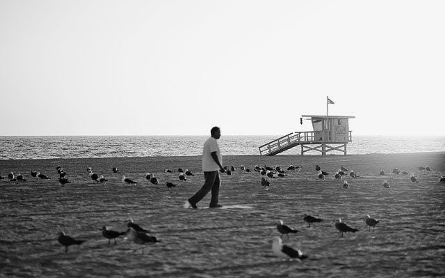
Los Angeles
I think it is going to stay that way. Unlike 3D where I think you can get a good deal on a used 105" 3D flatscreen in a few years.
Black & white does have it's charm, as well as an audience. Maybe the correct analogy is acoustic music compared to electric. Both nice, but for different things, and electrical happens to be the best selling. It's not long ago that all newspaper photos were in black and white, and only a few more years since all magazine photos were in black and white. And some times, even it is possible to print full color, we decide to stay with black and white. For example, who could imagine shooting jazz musicians in color?
A question often asked is if it is easier to shoot in black & white than in color. I think it is partly irrelevant if one is harder than the other. It is two different mindsets in that color is necessary for some things (editorial photography in our time) and you don't really have a choice. Hence you set out to get the best under those conditions. And taking black & white photographs requires that you can think in black & white and grey tones, and preview what would work as a photo.
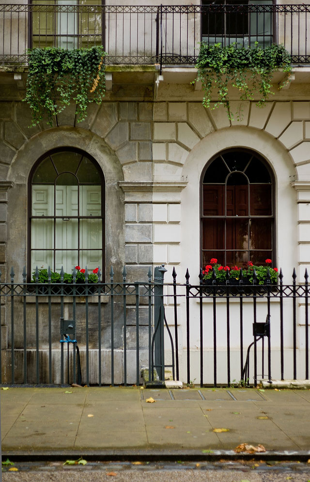
Leica M9 with 50mm Summicron-M f/2.0. Fitzroy Square in London, September 2011.
Photographing color raw and B&W JPG on the Leica M9 at the same time
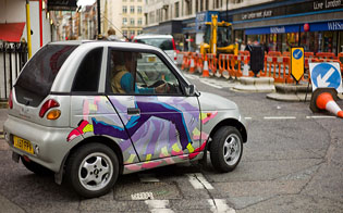
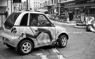
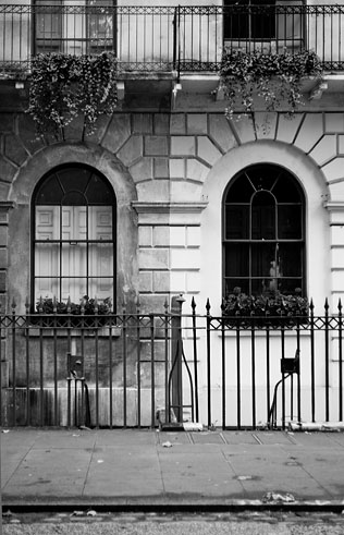
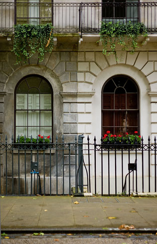
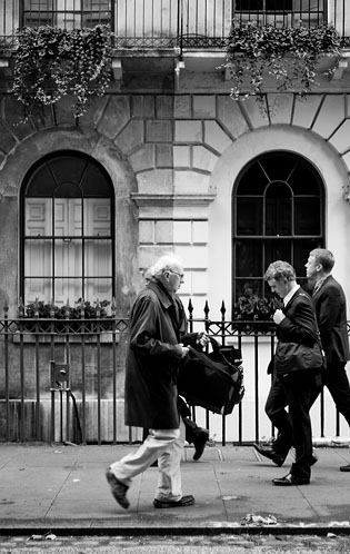
The interesting thing with the Leica M9 is that you can set the camera up to take color DNG (raw) files and black & white JPG Fine at the same time. Hence, when you view your photos in Lightroom you can see both the color and the black & white edition side-by-side.
 |
|
 |
| |
| How to set up color and B&W workflow side by side on Leica M9 and in Adobe Lightroom: |
| |
Leica M9: Set Compression to DNG+JPG Fine in the SET menu, then Color Saturation to Black & White in the MENU. Now the Leica M9 saves color raw and B&W JPG Fine of the same image to the card. |
| |
Adobe Lightroom: Choose the menu Lightroom > Preferences > General: Check the "Treat JPEG files next to raw".
Now Lightroom will show the color raw and B&W JPG Fine next to each other for future imports (if you want it to show this for previous imported photos, you drag and drop the relevant folder into LR and it will now import the JPG files that it omitted on the original import. It did import and and save them to the folder, but it didn't show them as previews (If you shoot other camera systems you may learn that they produce a JPG to do a preview on the camea's screen (in color), and Lightroom doesn't expect that you would want that JPG imported as the natural thing would be to work on the raw file).
In Aperture you can do the same, but be aware that in Aperture you must decide if you want to use the raw or JPG as master, or show both. You want both, of course, but if you shoot color, you should make sure it is the raw that is master, not the JPG. |
 |
|
 |
| |
|
|
 |
|
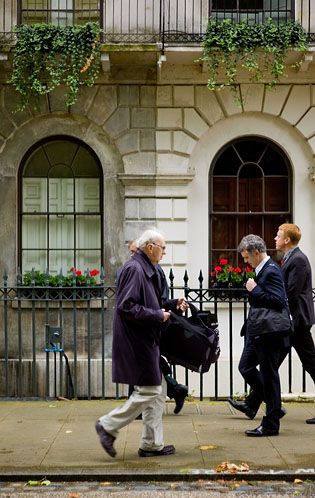 |
| Which is the best? I guess it depends what's happening in the image, and what you are using it for. But mainly it's your choice. Fitzroy Square in London, Leica M9 with 50mm Summicron-M f/2.0. |
What that will teach you is that some pictures are ruined by a blue banner in the background taking all the attention, or ruined by a mix of awful colors, or that the light conditions offered different color temperatures why the person is orange on one side of the face and cold blue on the other. In those cases, when you look at the black and white edition, that edition will be peaceful without the disturbing colors.
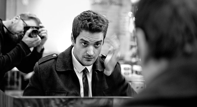
British actor Michael Koltes preparing for our shoot in the London rain
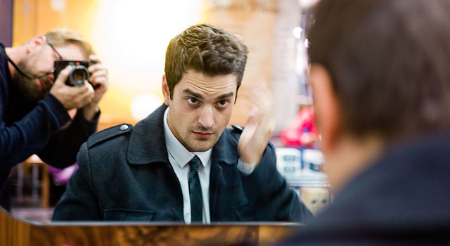
In other cases, the color edition simply tells the story better, or is what is required by popular demand, by clients or by editors. A sunset in black & white may or may not look better than in color.
Photography is about choices
Again we are back at a very important thing in photography: That it is all about choice. From the moment you have to decide if you are going to bring the camera with you or not, which lens to put onto the camera, is what you see over there a picture or not a picture (shoot it and decide later!), and finally in the edit – and here it is all about choice - is this a photo or not? Should I crop it this way or that way? Should it be color or black and white?
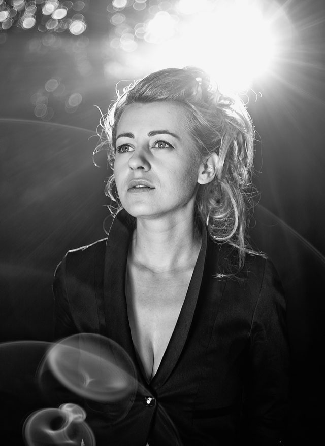
Singer-songwriter Catherine Kubillus. Leica M9 with 50mm Summicron-M f/2.0, with sun behind the trees in the background, and a reflector from the front (natural lens flare).
| |
|
|
| |
“Art is making something out of nothing, and selling it.” |
|
| |
– Frank Zappa |
|
The great - and unusual - thing is that it is all up to you. You decide from the beginning to the end what you want to do and what you want to finalize into a final photo (when I talk about final photo I'm talking about an image file you decide to make into a final edited photo for later use. That is a final photo).
In this day and age where the majority of people commute to work at eight and return after four, eat at dinnertime and watch the news to see what to think about it all, go to sleep at bedtime, it is unusual to engage in something where you decide everything and can basically make nothing into something without having to ask somebody or vote about it (no wonder the anti-terror laws are after photographers!).
Hence, the question whether color is harder than B&W or which is the better look, is irrelevant. Nobody knows the right answer. You make it.
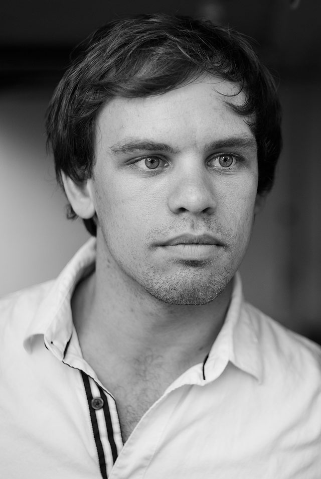
Alex Lake of Los Angeles. Leica M9 with 50mm Summicron-M f/2.0, 160 ISO using a silver reflector.
For me, it's a mindset. Some times when I work in black & white and I then start looking at some of the color photos, the colors give me a shock. At other times, the black & white seems dull and dead compared to the color versions. But more interestingly, I will stay in one mindset for a time period. When I travel from city to city I might do a whole city in black & white because that's the mindset I was in, and it doesn't work mixing the black & white with the color images. Then the next day, it is all color. And some days and some subjects, it works mixing color photos and black & white in the same series.
| |
|
|
|
|
| |
Buy the new eBook
"A Little Book on Photography"
by Thorsten von Overgaard |
|
| |
|
|
|
|
| |
Order now - Instant delivery.
More info
★
★
★
★
★
★ |
|
It's a humorous understatement to call this
new eBook by Thorsten Overgaard for
"A Little Book on Photography".
It's a grand book, a history lesson, life experience, a biography and poetry book and brilliant photo book!
All in one beautiful package of 180 pages
to fire you up and get you to love
photography ... unconditionally!
"A Little Book on Photography"
eBook for computer, Kindle and iPad.
New release March 2017.
Intro price only $47 - 180 pages.
| |
|
|
| |
Buy Now

Instant Delivery |
|
| |
|
|

|
|
| |
|
|
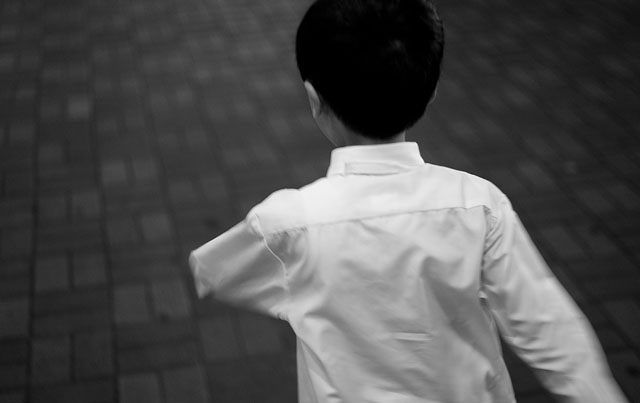
School boy in Hong Kong. Leica M9 with 50mm Summicron-M f/2.0
Video tutorial: Editing black & white photographs from the Leica M9 in Lightroom 3.6
To give an idea how I edit B&W photos in Adobe Lightroom I recorded this editing session of three photos in QuickTime screen capture. I may do more videos later, but if you want more on editing images, deciding which to use and which not and all, check out the Overgaard Lightroom Survival Kit which contain those along with a checklist on how to set up a workflow that works.
Why I don't use presets for black and white
When used properly, Lightroom offers what is necessary to obtain "your look" of black & white images. It might take a while to get there, but so does the look you want of color images, and actually every camera.
I have played around a bit with NIK presets in the past where you can get the look of Kodak or Ilford film. However, one thing is that your Leica M9 is not a film camera but a camera of the new digital age. But mainly I find that those are "effect filters" and not really your personal expression. I have met very few - actually nobody - who consistently used plugins or presets. It tend to be like an app for the iPhone that is fun for a while, but then you want a new one.
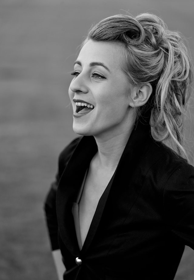
Singer-songwriter Catherine Kubillus. Leica M9 with 50mm Summicron-M f/2.0.
And what I am looking for in my photographs is a consistent look that is mine, not a new one. I think what I like and what I am looking for, is something that has a pleasant tonality - something that might resemble silver prints from the darkroom - or something that I consider "real black & white."
Advertisment:

Now, aesthetics does change. What we once considered being a cool color of a computer (beige in 1985) is no longer cool. The same goes for colors of cars, shapes of things and all. And so it would be logical that the digital age changes our view on what a nice tonality or what nice colors are.
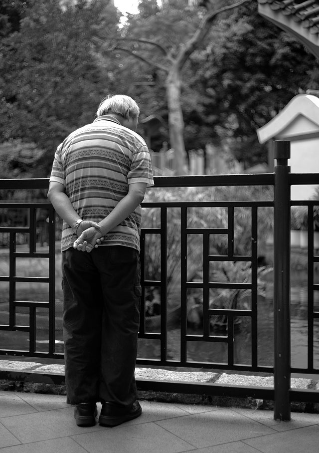
Hong Kong, Leica M9 with 50mm Summicon-M f/2.0, 160 ISO.
Kodachrome as the ideal look
It might be of interest to know that the Leica M9 and Leica M9-P, as well as the Kodak-Leica developed CCD-sensors for Leica M8 and Leica R9/DMR digital back, were developed with Kodachrome slide film as the ideal color look.
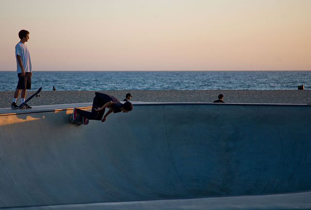
Los Angeles, California. Leica M9 with
90mm Summarit-M f/2.5, 80 ISO
Whether you agree or not that this is the ideal look, I think it is a comforting thought to know that Leica did have an idea and an ideal to work towards when they had to choose a look. Thing is, every sensor on the market has a look, just like any film and photographic paper had one. And it is better that somebody point to an aesthetic standard rather than leaving it to coincidence what the colors might be in the hunt for higher ISO and more megapixels.
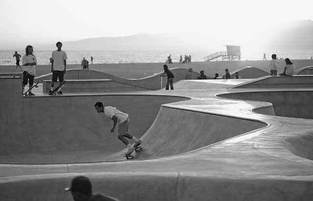
Los Angeles, California. Leica M9 with
90mm Summarit-M f/2.5, 80 ISO.
Whether anybody ever develop a black & white sensor of the digital age that will outperform the black and white films we have known and used is an interesting thought.
After all, since the first glass plates with chemicals applied to them acted as recording devices for light, the film development has been a never-ending race to get more accurate colors, more tones, less grains (or "noise") and faster speed. Always faster, and that is what ruins the colors and tonality; till somebody figures out a way to bend natural laws further. Upon which we want more speed on expence of color quality.
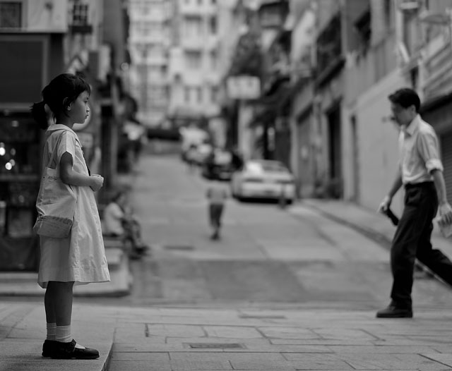
Hong Kong,
Lecia M9 with 50mm Summilux-M ASPH f/1.4 at 160 ISO.
Digital photography has been going through the exact same process, from awful inconsistent colors and slow speeds to more and more speed, more and more accurate colors.
But for black & white, no digital sensor has really taken over from the black and white film and continued that development to new heights.
What we do have are sensors made for color images, and the Leica M9 happens to offer a black & white look that is quite interesting and will perform quite well compared to any currently known standard.
| |
|
|
|
|
| |
Buy my "New Inspiration Extension Course"
|
|
| |
|
|
|
|
| |
Need more info?
Read this article. |
|
Get inspired and rebooted!
This extension course if made for you! It can be done at home and travel at your own pace. I have taught workshops for years and the Overgaard New Inspiration Extension Course is my experience compressed to a package of training, articles, drills, assignments and video tutorials that will inspire you and take your photography to the next level! For a limited time my course includes something you cannot get anywhere or anytime else:
A portfolio-review by Thorsten Overgaard.
| |
|
|
| |
"The Overgaard
New Inspiration
Extension Course"
For computer and iPad. 181 p eBook. |
|
| |
Only $798 |
|
| |
|
|
| |
 |
|
| |
|
|
| |

|
|
| |
|
|
Order now - Instant delivery. |
|
| |
|
|
|
|
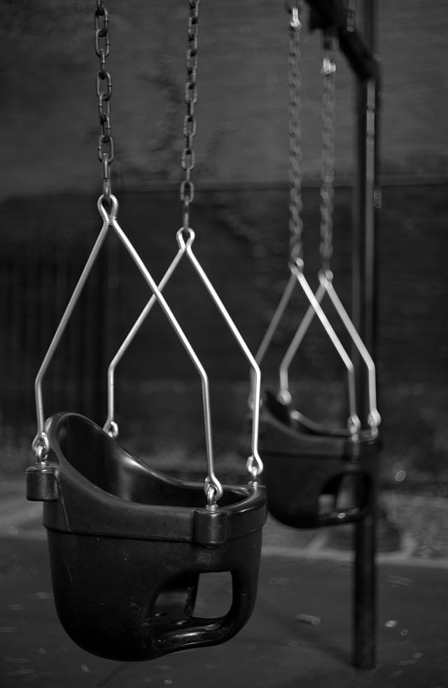
Childrens playground in Brooklyn, New York. Leica M9 with 50mm Summicron-M f/2.0, ISO 80.
My black & white editing in Lightroom 3.6
First of all, my way of dealing with black & white photos has simply developed from I started using Lightroom 2.5 for this, and to my knowledge there hasn't been any technological development in camera profile or Lightroom itself that has changed the look.
As a side note, I know that Frank Jackson shoots film which he then scans, cleans in Photoshop for dust and then imports in Lightroom where he adjusts them as you would adjust any digital file, and uses a preset for printing them in what he considers a better output than what he was able to do in the darkroom.
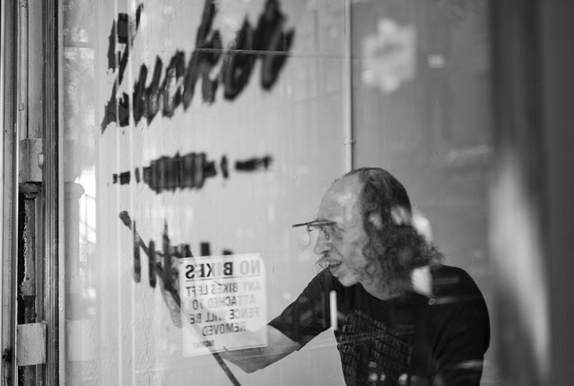
New York, Leica M9 with 50mm Summicron-M f/2.0, 80 ISO.
The tools I use for (both color and) black & white are the ones in the upper right corner of Lightroom. You should play around with them and see what they do so as to get the full conceptual understanding of which controls to touch to achieve the look you envision.
I think the look one envision is based on one's experiences doing stuff, coupled with things you have seen before and things you see inbetween. It's a learning process as well as a development of an aesthetic expression.
I remember some images I saw at the Guggenheim in New York back in 1996 as a reference point for the kind of grey tonality I like to refer to as "silver print". But if I think about it, I don't think those images looked like what I remember, if I revisited them. Instead I think I have built a mental pre-vision of how a black and white photograph should look.
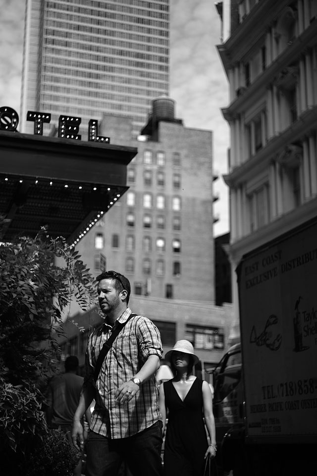
Outside the ACE HOTEL on Manhattan, New York. Leica M9 with 50mm Summicron-M f/2.0, ISO 80.
The tools for black and white in Lightroom
These are the few tools you need to use in Lightroom in the Develop mode. Despite all the menus and sections, these are the ones you use. You can fine tune these tools and the area of their effect with the rulers, but I don't. Everything in my Lightroom is standard, including sharpness. My only adjustments are the ones I do on the few Basic treatments available. Thus I can use any Lightroom installation and achieve the look I want:
| |
|
|
|
|
|
|
| |
|
|
|
|
|
|
| |
Exposure |
|
Adjust the overall exposure |
|
I use this to correct acutal over- or underexposure. |
|
| |
|
|
|
|
|
|
| |
Recovery |
|
Recovers highlight details and some details in middle-grey areas. |
|
I almost always use this as it gains back details, it's like increasing the dynamic range of the sensor. I hardly ever go above +30 as it tend to look un-natural. |
|
| |
 |
|
| |
Fill Light |
|
This works like a reflector sending light into the shadows. |
|
Fill Light and Blacks should work in pair so that you Fill Light to gain a lot of shadow details; then Blacks to get back that contrast you lost by using Fill Light. |
|
| |
|
|
|
|
|
| |
Blacks |
|
This make the shadow areas (darkest areas and black) more black |
|
|
| |
 |
|
| |
Brightness |
|
Especially midtones are made brighter with this, but the overall look will be "harder" and more contrasty with this compared to Exposure. |
|
Brightness and Contrast should work in pair so that you increase brightness which wash out the image; then you get back contrast by using Contrast.
Often you may reduce Exposure so as to leave space to increase Brightness; because these two as a pair basically does the same as Exposure but adds contrast, definition and "bang" to the image.
|
|
| |
|
|
|
|
|
| |
Contrast |
|
Increases contrast by making the difference between shadows and bright tones bigger (increasing black and decreasing brighter tones) |
|
|
| |
|
|
|
|
|
|
| |
|
|
|
|
|
|
To get a grip of what each Treatment above does to the image you should open a black & white image in Lightroom and play with each of them and notice what they do to highlight, midtone, shadow and the overall look. The ideal is that you can pre-vision the potential look of an image when you see it the first time, and then use the rulers to get there.
Thought I tend to do somewhat the same with each picture, there are degrees of adjustment in all the above for each image. And how each is used has to do with what the other controls do. Hence I wouldn't even consider developing a standard adjustment for all my images. It wouldn't work in optimizing each individual image to become the best it could be.
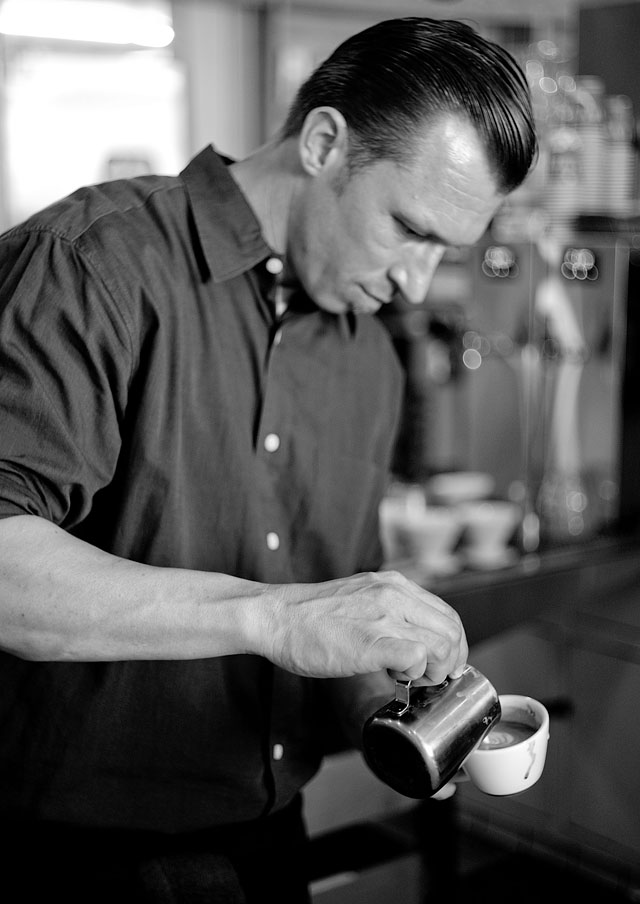
Barista in the Intelligencia espresso bar in Silver Lake, Los Angeles. Leica M9 with 50mm Summicron-M f/2.0, 800 ISO.
If you want to "industialize your workflow" a bit and apply the same adjustments you just did to a similar image, it's much better taking the one you just made, Copy (the button in the down left corner of Lightroom) those adjustments, then Paste (the button next to Copy) them onto the next similar image. That will give you a starting point for a similar image with less work; some times all the adjustments you need.
Lightroom is a workflow tool. It's about getting the desired look as fast and painless as possible. But each image you choose to make into a final image should be an individual pre-vision of what is possible, and then an adjustment towards that.
A note on 80 ISO PULL, 160 ISO, 800 ISO and 2500 ISO
The Leica M9 offers a 80 ISO PULL an whilst I for a long time thought this was just one step in ISO, like the difference between 200 ISO and 400 ISO, I learned some months ago that the 80 ISO actually take 3 stops of dynamic range (on each side) why it is more destructive to the detail of the image than 800 ISO.
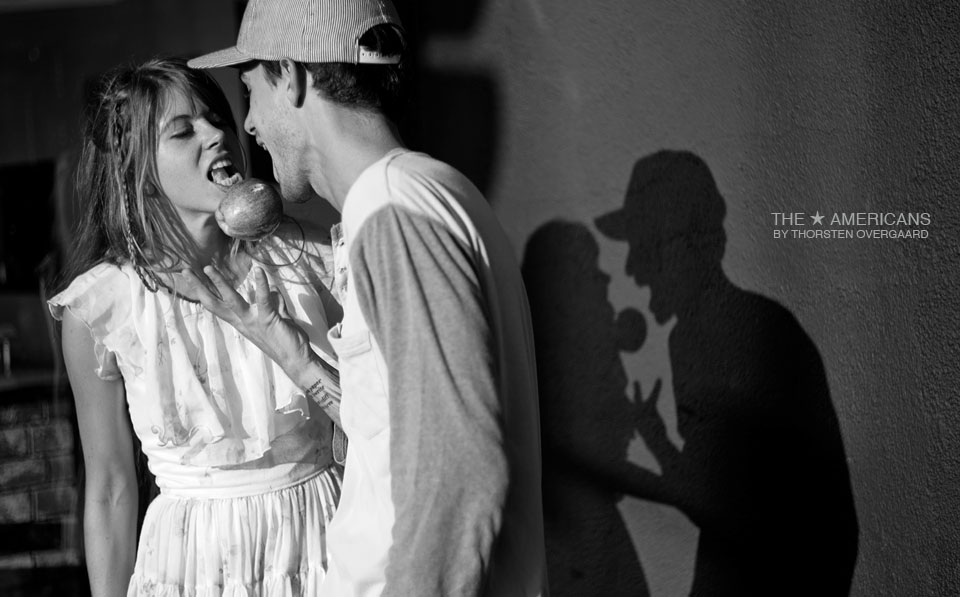
This is a 80 ISO PULL phtotograph that was overexposed and where I had to gain back as much greytones as possible. It would have been much easier if I had shot 160 ISO. Leica M9 with 50mm Summicron-M f/2.0 at 80 ISO, 1/2000. Melrose, Los Angeles.
As 80 ISO is that you would usually use in conditions with sunshine and strong light, this is a very bad idea - as those situations are where you usually deal with very high contrast (bright highlights and dark shadows). So the proper way to go about with this is to get a ND filter (Neutral Density filter; a grey filter that take 2, 3 or 6 stops of light out of the image by simply making it darker). This will enable you to shoot at 160 ISO in sunshine.
In the most typical sunshine, an f/2.0 lens will require a 1/8000 shutter time at 160 ISO, an f/1.4 lens will require a 1/16000 shutter time, a f/1.0 Noctilux lens will require a shutter time of 1/32000. Hence, you will need a 3 stop ND filter for a Noctilux to shoot sunshine at 1/4000 at 160 ISO. And 3 or 2 stop ND filter for the Summilux f/1.4 and Summicron f/2.0.
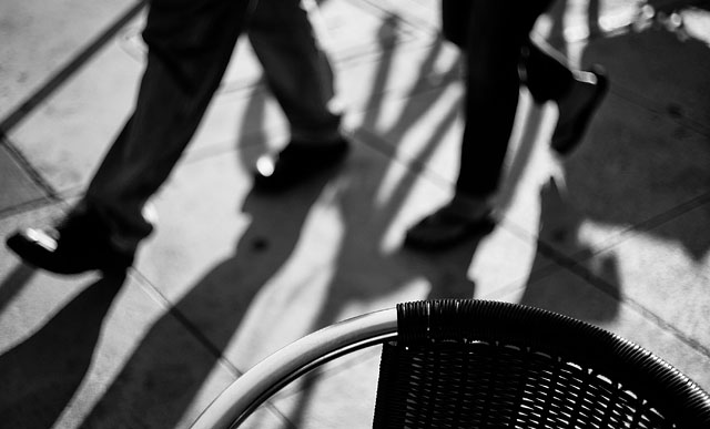
The proper ND-filter for the Leica Noctilux
You may go darker, for example 6 stop ND filter, on the Noctilux, but the beauty of the 3-stop ND-filter on the Noctilux is that you will be able to shoot even indoor with it (by going up in ISO, to 800 ISO if you need it) without removing the filter. So you put on the filter when the sun goes up and takes it off when the sun goes down. This way you don't have to take the filter off when you want to shoot inside during the day.
ISO 2500 may work for black and white
Where I never go above 800 ISO for color photos, I may consider 2500 ISO for black & white. The reason I never go above 800 ISO is because I want to be able to use every image I do. And when you go above 800 ISO it might work, it might not. Some times skin tones and other becomes really dirty and odd, and then it can't be used (if you have a commercial client who asked for color photos). So, for me, it's better staying at 800 ISO and try to have more steady hands and simply shoot more to get one that is good. Hence it's not that often I will go 2500 ISO to gain more speed. But I sometimes do.
Also, the noise level (and control of correct colors in pretending a 160 ISO sensor can really see in the dark) lies in the Lightroom software and camera profile. So future updates will improve the quality, both on the photos you take in the future with that software; but it will also enable you to re-work your older raw files.
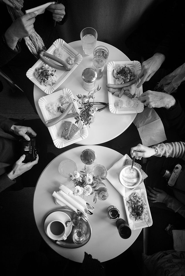
Berlin, December 2011. The workshop is out for a German lunch. Leica M9 with 21mm Super-Elmarit-M f/3.4
Lightroom does a better job than Aperture (cross your fingers)
Leica and Adobe work together in that you get a free Lightroom license with the Leica M9 and Leica M9-P (and most Leica cameras in fact), so they share information so that Adobe can develop the best possible camera profiles.
On a few occasions we have discussed which is best. Controls are named differently, but to some large degree you should be able to do the same adjustments. I asked around some months ago, and had a number of photographers who told me they had changed from Aperture to Lightroom because of quality in mainly black and white.
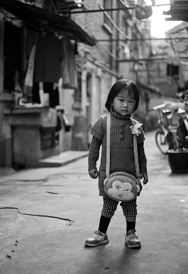
Shanghai, November 2011. Leica M9 with 50mm Summicron-M f/2.0, 150 ISO.
I mention this because that is as far as I am going to research that subject. I really don't care what other software can do if what I use works for me, unless I hear of something that is fantastic. Then I will try it, and if it works better, I would stay with it. So as a starting point, the Lightroom offered with Leica is a good bet.
In retrospective, Apple makes great stuff that works, and Adobe has a long history in graphic design and imagery. For me it does make sense that Adobe should have more knowledge than many others in how to deal with imagery.
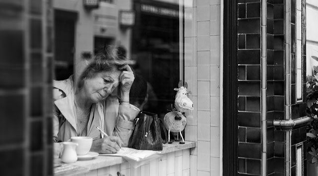
The Fitzroy Dairy café in London. Leica M9 with 50mm Summicron-M f/2.0, 80 ISO.
Supporting this site
| |
 |
| |
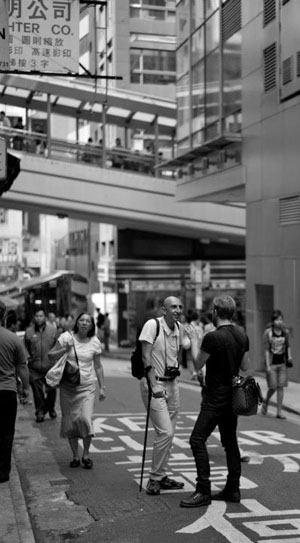
On the streets of Hong Kong with Younes Kabbaj. Photo by Brian Loo of Singapore. |
| |
|
I don't offer the possibility for donations. This webpage mainly exists because I like to preserve things and share knowledge. The website was started and has been maintained because I genuinely love to talk about this.
It's my website, and you're my guest.
And I believe one should always just do what one feels like - then later one will find out why it was such a good idea (if that is even important), and how to get some food on the table. That's how all great music, books and great inventions were ever made. Nothing great ever started with a business plan; it always starts with an urge to help somebody doing something better. Passion!
I make my living as a photographer and writer and by teaching photography seminars and workshops all over the world. Those activities are what keep me alive and sponsor my lavish lifestyle. I believe in something for something, and as long as the website is visited and a few of the visitors find it interesting to hire me to photograph, fly me in for personal tutoring, buy my extension courses, hang my art prints on their walls or participate in seminars and workshops - then it all make sense.
So be my guest and feel free to share and comment.
 It's tough, but somebody has to do it. On the photo it's Winston Chua of the Philippines being taught never to have a lens cap on the lens. In the background Anton Candra of Indonesia. Photo by Mike M-Theory Liang on the Hong Kong seminar, November 2011. It's tough, but somebody has to do it. On the photo it's Winston Chua of the Philippines being taught never to have a lens cap on the lens. In the background Anton Candra of Indonesia. Photo by Mike M-Theory Liang on the Hong Kong seminar, November 2011.
|
![]()
