100,000 Exposures Later ... [PART III]
Dodge and Burn
By: Thorsten Overgaard
| |
 |
| |
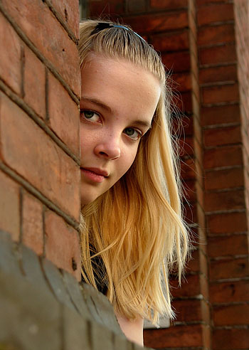
My daughter Caroline and her twin brother Oliver |
| |
 |
Today there was a meeting at my daughter’s school, and the message basically was that she was doing extremely well all over the line. Her math teacher even threw in a remark that “in her case the school money was really well spent” which I take as areassurance that we get a lot for our money ;-)
It happens so that my daughter Caroline has a twin brother, Oliver, who’s 14 minutes younger than her. And they both changed school few weeks back, to a public school, because they would like to be in a bigger school with more friends (and closer to their home).
After few days Caroline was very unhappy with the new school and wanted to move back to the old one. She wasn’t doing well in the new school and wanted to come back, perhaps partly because she had really had a breakthrough with her math teacher in the old school and had cracked some difficulties in that subject and become the best in her class at it. Now she was afraid she might get lost in the new scool, and the school would be unable to catch her.
So we asked her to consider all the things for and against each school and make her own decision – eventually find a third school. Friends, teachers, distance and all things considered now and in the future.
After some days she had decided to move back, and did so. Her brother stayed at the new school, very happy with that one.
Those of you who know twins know that separation to some degree can be healthy. Or at least a relief.
I mean, sometimes they are at each other as a married couple who’ve been married for 40 years or just … too long!
By the way, here’s a shot from her first day in school some years back:
![First schoolday [Leica Minilux]](grafik/leica_hires/Minilux/caroline_first_schoolday_02_NEW.jpg) First schoolday [Leica Minilux] First schoolday [Leica Minilux]
That’s a picture that actually captures her personality well. This concern if you can do things right, how the world is, why people do as they do, that you should help animals and people – and so on.
Reminds me the picture of my son on the same first school day, which reflects his personality to some degree. Not concerned about anything, know he can do what he wants to do and learn anything he wants to. So he focus on playing with his friends and can say words and phrases that leave me completely blank (there’s this complete lingo around War of Warcraft and stuff like that).
My daughter said something interesting to my wife the other day. Oh well, my wife is not Carolines mother, even many often compliment Caroline how much she looks like her mother! And she does look like Maibritt a lot, though her own mother has black hair and looks way different.
Though my life is not as complicated as a Canon camera, it’s complicated enough that I will not go into further explanations. These ages of serial monogamy…!
So she said something interesting. She said about her school, “I just couldn’t choose friends over knowledge,” meaning she had to choose the school that would give her the most knowledge, not the one giving the most friends.
It’s part of the story that the private school teach students individually, so you are at the level you have risen to through study, not through age. That way you can finish school in 7 years, 10 years or 13 years. When you’re done, you’re done. And whatever trouble you get into, the school help you through it.
Different from public schools here in Denmark where the philosophy basically is that everybody is the same – or should be the same. I so much hate that viewpoint (which, by the way, is the marxistic viewpoint on people, adopted from psychiatry where people are considered animals and not beings). Anyways, this was not what this article was about.
As I did with my wife some weeks ago, I also did a photo shoot with my daughter. A bit shorter though, because she only had 45 minutes because she wanted to go visit her friend Christina. Whom I got a good shot of as well, by the way.
My daughter wants to become a fashion model. I know many people today want to become “rich and famous” so I’ve been so-so about the idea. She even once stated, when I asked her if she could only be one of the things, if she then would prefer rich or famous, that she would in fact prefer just being famous. Hmm…
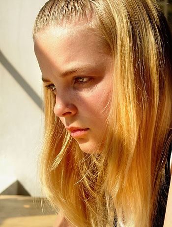
![Caroline [Leica Digilux 2 with a 100cm gold reflector]](thorstenovergaardcom_copyrighted_graphics/L1280911_CROP_GIFT_Caroline-Overgaard_640w.jpg)
Caroline [Leica Digilux 2 with a 100cm silver reflector in straight sunshine]
Hell, when they were four years and sat in the backseat of the car, they often said "When we grow tall and you becom small, we'll decide when to go to McDonalds and when not" and stuff like that. Kids have an interesting logic.
From a Western materialistic viewpoint it's complete rubbish. From a Eastern, say Buddhist, it's completely logically. By the way, one will be reincarnating in circles around the same persons, making family members take different roles as parents, kids, spouse, etc throughout eternity. Make it even more logical that my kids will come to decide over me (which is why they got an iPod very early).
Hey, did I throw you all out of this universe. All right, let's get back on track.
But it’s a big thing these years, being rich and famous, not just amongst teenagers, also amongst grown-ups. They would like to be rich and famous. It’s in surveys again and again (which is why, if you eat Kelloggs, you will become rich and famous, according to the artwork on the package).
Anyways, I think talent is a fair basis for fame and becoming rich. Fame in itself is a tricky thing and may often imply doing odd things to acquire it, and perhaps loosing that fame very fast.
If you'r fame is not based on talent, it's basically not your fame and could be taken away by whoever installed you with it.

You go a long way with talent.
| |
 |
| |
Caroline [in front of panorama window with 60 cm silver reflector from below, Leica Digilux 2] |
| |
|
But she’s become more serious about it, and after we went to some fashion shows, she really liked the idea.
So ok, we shot a series that will go to a model agency and we’ll see what happens. I’ve told both my kids, that they better start figure it out and become serious – as to what they want to do – because they’re expected to be able to buy their dad a Ferrari before they turn 18 ;-)
Oliver might invent some new bloody game, I guess, or become the first paid online gamer. Who knows?
Or succumb in his room with empty pizza boxes and Coca Colas bottles – in which case I will have to take the bus. Actually I don't have ambitions on behalf of my kids. I think they will do nutty things, fun things, and I'm confident they will do whatever they will do, well.
In my school we had kids who's parents would declare that their son was going to be a doctor, and often the boy himself believed he would (sometimes even behaving as he had acquired that status). However, I've also noticed that almost all of those going-to-be-kids never became anything.
Gave up life, became tired of being doctors, lawyers and all before ever getting there...
It was kind of interesting shooting her for real, in a half-formal way, though only 45 minutes. Even that is longer than ever before, and she always complains it’s boring. Which is a viewpoint she might have to change if she want to become a paid model.
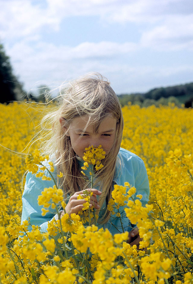
Some years ago, she was pissed she had to spend three minutes on doing this.
[Leica Leicaflex SL mot, 80mm/1.4]
Advertisment:

But in shooting with her, I discovered she might have some talent. By which I mean some uniqueness that is different from other young girls who want to become rich and famous.
| |
 |
| |
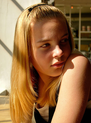
Caroline [in front of panorama window with 60 cm silver reflector from below, Leica Digilux 2] |
| |
 After [left] and before Photoshop
 |
She has this drifting look which is really cool. Mostly because you seldom see it that often on models.
I mean, her own response to the pictures was that she didn’t like them all because she didn’t look smiling on all of them!
We’ll see what the agency think about it.
Another thing I noticed, when doing the PhotoShop thing, was that her skin was very good and needed no fixing of dead skin or other stuff. I mean, you just throw her in front of a camera and she looks like she does.
What I do in PhotoShop and which is something I might get back to in depth later, is a series of very distinct tools, that all aim at “painting with light” in certain places. I seldom do general adjustments of levels or colors or stuff.
To the right is the difference between before and after a 4 minutes touch-up in PhotoShop:
I mainly use dodge and burn. I dodge highlights to become 10% lighter, and then I burn shadows to become 10% darker.
That mean you choose the tool, say dodge, set it at 10% intensity, makes sure what is being dodged is highlights (not midtones or shadows), and then I run that tool over the eyes, the hair, jewrelry and anything other that is bright and shining. The more times you run over a piece of the picture, the brighter the highlights become.
Skin can’t take that much dodge, only very light and make sure you don’t change the face expression or shape by doing it.
I often also use it to calarify lines, say the chin, details around the nose and stuff. That bring you into drawing or painting for real.
I think a rule in portrait and model photography is not changing the characteristics and personality. Fix dead skin, make the appearance more brilliant. But leave birthmarks, scars and other personal stuff untouched.
Burn brings in contrast and shape. Be careful not to burn tiredness into the face by making the area under the eyes to dark. Just slightly add contrast. And don’t smear the face with darkness so the person looks dirty.
The philosophy behind this is from the Danish painter P. S Krøyer. Around 100 years ago there was a colony of painters, poets and writers living part of the year in the farthest North part of Denmark, Skagen, because the area is surrounded by water and other things that create an incredible nice light.
But P. S. Krøyer’s paintings had something about them that I was wondering for some months about what was. I’ve even been standing glaring very close to his paintings to see if it was the amount of paint, the color harmonies or whatever made them so lively and sparkling.
So one day I noticed what it was, as you can see here:
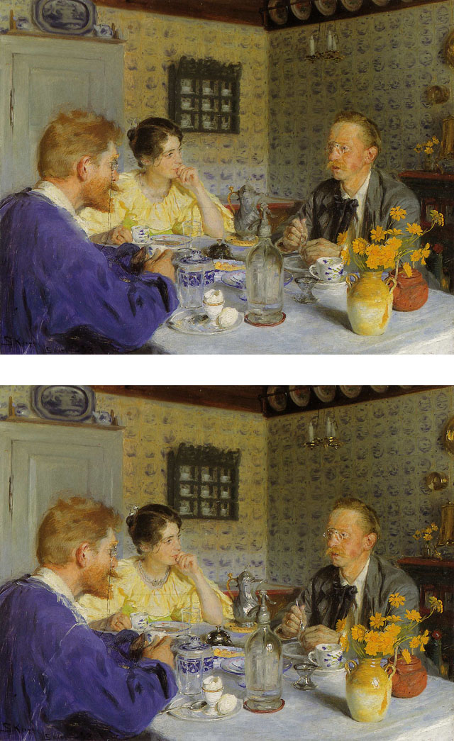
The lower one is the original and in the upper one I’ve removed all the highlights in the picture. The upper one is a cool picture. The lower one is an amazing one.
Because what he does is that he make unnatural highlights by using a tinted color. If yellow brass, he mixes white paint with a little yellow and add nightlights. If a blue or grey bottle, he mixes white paint with a little blue and adds highlights with that color.
Tinted colors often appear much more clear and strong than clean white or clean colors. For example 90% yellow is much stronger than 100% yellow. So if you’re doing a packaging for Kelloggs you really want to stand out in the shop, make it 90% tallow instead of 100% yellow. It will appear as a special yellow that might even light in the dark…
Another reason for using tinted colors is color harmony. If you added a field of white paint with a little blue in a piece of brass it would break the harmony. So you have to add yellow to create an adjacent harmony.
Ever used a color wheel? On that you can see which colors goes how with which. Say, green goes well with blue-green because it’s a adjacent harmony.
Red and green is opposite on the wheel and cerate a contrast.
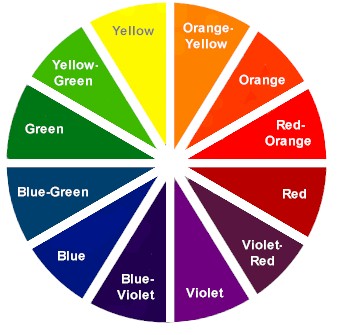
Color wheel
Which has really nothing to do with this subject, though interesting for many other reasons. I forgot which color wheel is state of the art, but shoot me an e-mail if you really want to know (it’s in another building right now). Many weird ideas of color compositions and wheels exist, but there's one simple wheel which look very much as the above and contains the basic facts of colors.
 |
|
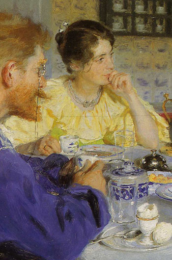 |
Brass more sparkling than reality |
|
Highlight in hair, cups, spoons |
| |
|
|
P. S. Krøyer really loved brass and when you look throughout his production you will notice how he never left the chance to create brilliant lively brass in his paintings!
Note how he uses highlights in hair, cups, spoons and all. And how he uses tinted colors to create some sort of highlight in the clothing and all. I mean, you can’t buy a dress that beaming anywhere!
An interesting thing with this technique is that things appear sharper. In the before/after example of Caroline above, the only difference in sharpness is dodge/highlight. Yet the whole thing appears sharper. Hair can appear so nice and sharp and clear it’s unbelievable.
Look at the hair on the above painting. It's really not hair, but it just looks like very sparkling and sharp hair, doesn't it. It's handling of light.
But mainly pay attention to the eyes, which apart from being the “mirror of the the soul” is also a kind of humanoid jewelry.
I should mention that if people have glasses, jewelry around their neck or on the ears, highlight it as well. Work with the contrast in it. In the same was as a beautiful woman can radiate royalty and class with nice diamond earrings, so can you add class and sparkling royalty – or simply life – to a person and the whole scene in the picture by upgrading their jewelry and stuff.
Jeans, by the way, is an intersting thing to work with, because you can hightlight the light fibres inthe jeans, then burn the dark blue ones. The result will be very lively and sparkling jeans. Looks very clean, too!
All this of course leaves us with the never-ending question. Just how far should we go in PhotoShop?
When you look at the old photographers, you will notice that some of the great documentary and war photos from World War I and II has been fixed in the darkroom so that there’s suddenly a person more in the photo (for dramatic effect or for balance), as well as a lot of other stuff we thought was only possible in today’s world.
But no.
We can discuss, but I think it’s somewhere along the theme of being truthful and loyal. And I mean to both the person(s) in the pictures, as well as the audience looking at it.
Thanks for listening.

Blog Comments (22)
Posted by Tigran on July 25, 2008 4:28
Great post. I really enjoyed reading the case study of Kroyer, you gave a lot of nice examples that had me going back and forth. I am going to keep an eye out for those details, and everytime I find one it will remind me of this post :)
Posted by Thorsten O... on July 25, 2008 4:53
Glad you liked it. I guess one could learn a bit about colors and lightning if one studied more of the old master painters.
There's a lot of technique development going on if one spend days in front of a canvas. Might as well take advantage of their work ;-)
Posted by Rodolfo on June 19, 2008 9:34
I had this impression that you were sort of a purist and didnt mess around with PS, who knew!
Posted by Thorsten O... on June 20, 2008 3:54
Oh, I ruined my image now. No, I sort of wasn't with film,because film is perfect in a sense. But with digital I feel you have to "guide" it - or that the raw digital file is imply so far from what could be done with film, that you have to fix it.
Which then leads to the next, that for example dogdge and burn you can easily do in diigital files, whereas it won't work the same way in a film scan (beause of the grain that can be dark areas with highlights in between)
Posted by Tallulah on June 11, 2008 1:57 AM
thank you for the super blog! :)
Posted by Thorsten O... on June 11, 2008 2:23 PM
You're most welcome!
Posted by equivoque on May 31, 2008 1:33 AM
First of all, I definitely wouldn't wish for my daughter to become a fashion model. The power is behind the lens! I do so love their logic though. I'd take the money over the fame any time. Youth, they say, is wasted on the young. I'm comfortable and adept at Photoshop, but I agree that natural features should be left in tact. I clone out pimples that are passing features but leave moles in place. If I photograph my mother, I leave the lines of her face as they are. They are part of who she is.
An interesting thing regarding Photoshop is that people grow less and less clear (over time) of the boundaries between touching something up and doing radical things that result in a digital image rather than a photograph. Well, I admit it. I'm a purist. Nice to see someone using Photoshop for purposes that live within the boundaries of actual photography!
Posted by Thorsten O... on June 11, 2008 2:27 PM
"Youth, they say, is wasted on the young." - ha ha, that's a good one. I'll tell my kids (and wife) next time they don't behave. Agree on the purity in Photoshop. Though, sometimes I dodge a dark shadow from below the eyes or some "tired lines" that stand more out in the photo than looking at the person in real life. It has a lot to do with how they would like to seem them self, and how you would like them to be.
But lines, on other pictures, might be that exact quality, that person should have. Whereas if the quality is that they look happy and young at hearth, a disturbing line ... well, it must simply go!
Posted by Richard Po... on May 30, 2008 9:55 AM
Really, really enjoyed reading this! I think that when using dodge and burn (the right way) you can take a great picture and just add that extra punch it needs to elevate it to even that much higher. The opposite can happen also. Many times I’ve seen a decent picture completely butchered by too much dodging and burning... and I’m not even getting into calibrated and non calibrated screens. At the end, its really the person taking the picture and retouching it who need to have the talent to do so.
By the way, your pictures are fantastic! Really like the 3 first ones!
Thanks for the info... especially about painting highlights.
Have a great weekend!
Posted by Thorsten O... on June 11, 2008 2:31 PM
Thanks. As said elsewhere, I think retouching has a lot to do with clarifying and getting more of that persons personality. If a face or model looks odd, weird or whatever and one think it needs to be changed for it to work with a certain article, ad or message, they're simply in the wrong context.
Be yourself, I think. That's the direction the retouch should take. Not changing a person into something else.
Posted by Mark Taylo... on May 30, 2008 6:26 AM
A fascinating read. I really agree with your philosophy about life in the first part of your blog. And your photoshop methodology is very interesting.
I am always wary of photoshopping as it can make a photograph deviate from the truth too much and make images become too clean and shiny.
I think I agree with Chris V about the catagorisation of art into photograph, graphic design etc.
I can see how your treatments enhances an image rather than turning them into something completely different.
It's a long debate and a very fine path to navigate!
Hope you enjoy your weekend!
Posted by Thorsten O... on June 11, 2008 2:37 PM
Thanks. I think - as a general rule - what I Photoshop towards is better lightning. I use reflectors (a silver 2 feet or 3 feet in diameter) in many occasions, but often I don't get enough light from it. And then PS can actually remedy that - plus strengthen a few other bonus things such as apparent sharpness and contrast.
Chris Weeks' distinction between graphics and photography is a great rule and spare us for lots of discussions - because sometimes it's just out of the photography range.
Posted by Ovidiu Mor... on May 30, 2008 6:16 AM
thnak you thank you...
I read all your blogs but on the 2,5inch monitor of my nokia so now(on my laptop) i must say you are really inspiring me!
great great job! Posted by Thorsten O... on May 30, 2008 9:10 AM
That's what I call a dedicated reader. You just made my day, thank you!
Posted by Ovidiu Mor... on May 30, 2008 9:23 AM
;)
Posted by ola on May 30, 2008 2:57 AM
great blog and great tips. I'm so glad i've found uber with all the great photographers blogging. I think it's giving me some speed up my learning curve.
Please share more tips on composition and post processing (photoshop)
thank you!
Posted by Thorsten O... on May 30, 2008 5:32 AM
Uber.com is truly a creative heaven, yes. I'll try to get into composition as well, later on.
Posted by Valdudes on May 30, 2008 2:41 AM
This is a great read. I love how you are uniting painting and photography because for me they compliment each other. . .inspire and learn from each other, and you captured this well in your short "essay".
Concerning the question of how far should we go in Photoshop. . .well that's a great subject for debate. If the context is portraiture, journalism, then photoshop should be minimal. It really depends on what you want to achieve in the end with the photograph/digital editing. Afterall we humans, as beings, have a longing bigger than us, beyond the raw everyday truth that we experience in our daily lives, so of course someone. . .a LOT are going to manipulate to achieve fantasy. The issue should be what you classify your work as. Chris is right when he says that heavily manipulated photos are graphic design. The retouched portraits I have on my portfolio site are in the graphic design category. I'll use whatever technology/tools I want to achieve my vision, always being true and loyal to if it's actually a photograph, a digital manipulation, an oil painting, a photograph that was then hand drawn on paper, scanned and digitally composited blah blah you get the idea.
Loved the first day of school pictures.
Posted by Thorsten O... on May 30, 2008 5:21 AM
Thanks.
As in every other area of life I think it's perfect if personal responsibility and integrity regulate things, rather than rules and laws.
I find the news wire's rule books ridiculous childish, though some consensus as to what is "good reporting" is needed. Mind you, the rules only say what the photographer is not allowed to, not the graphic designer preparing the shot for publication. Hence, it's just for appearance.
Anyone ever heard of videographers who wasn't allowed to edit the tape?
Anyone who has been near by a newsroom would know manipulation take place big time. Things omitted, twisted, change of sequence ... you name it, it's in the news.
My good ol' rule about that "I will only take pictures of people which will do good for them" is a great rule, if I'm allowed to say so. Because it's a matter of personal integrity, as well as setting a limit for the PS work. That sometimes it's OK to make a model's skin look like bronze, sometimes not. Etcetera. But what a great topic for discussion it is.
Posted by Valdudes on June 03, 2008 2:35 AM
That's a great rule, that "...which will do good for them". I'm going to ask myself this when I decide on sharing a picture. So true about the news too. It's nice to have an intelligent discussion with intelligent people, whew.
Oh and yes you better believe I can cook, thanks ;)
Posted by Plastic on May 29, 2008 10:43
man i love your photography. and photogshop can be really helpful to just do little touch ups like that.
Posted by Thorsten O... on May 30, 2008 5:34 AM
Thanks for the comment. I'll get into RAW/JPG and photoshop later - and why it's a good idea to know photography, when photographing, not relying on digital trick to make it right. [Closed for comments, but feel free to send comments and questions to me at thorsten@overgaard.dk]
|
![]()
